Have you ever looked at a price chart and wondered, “Why on earth did the market reverse exactly there?” Or perhaps you’ve experienced the frustration of a strategy that works beautifully one day only to fail miserably the next.
Let’s be clear: the answer to these questions isn’t found in a magic indicator. Instead, it begins with one foundational concept: market structure trading. This approach is about understanding the raw architecture of price action—the very language of the market. Consequently, if you don’t get structure, you’re trading blind.
In this guide, we’re going deep. No fluff. Whether you’re a beginner trying to make sense of charts or an experienced trader looking to refine your edge, this is for you. Specifically, we’ll break down how to identify market structure, spot shifts, and use the right tools to confirm your analysis. This is the foundation every successful trader needs.
The Bedrock: What Exactly is Market Structure?
First things first, let’s define our terms. Market structure is essentially the framework that price creates as it moves. It’s not random chaos; rather, there’s an underlying order that the constant battle between buyers and sellers forms.
When traders talk about market structure, we’re referring to the sequence of highs and lows on the chart.
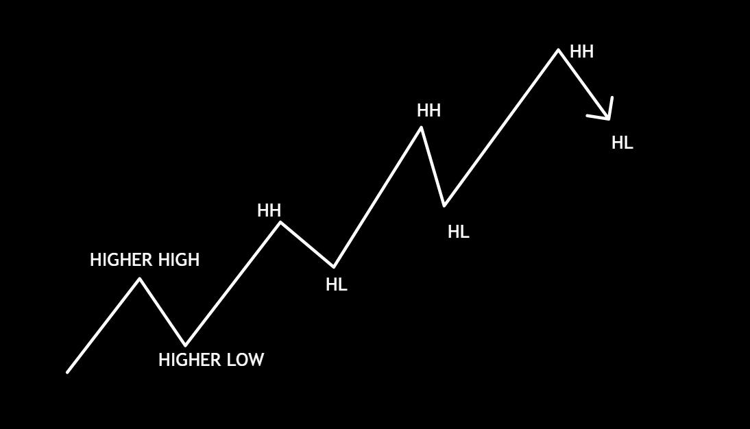
- An uptrend (bullish structure) shows a series of higher highs (HH) and higher lows (HL).
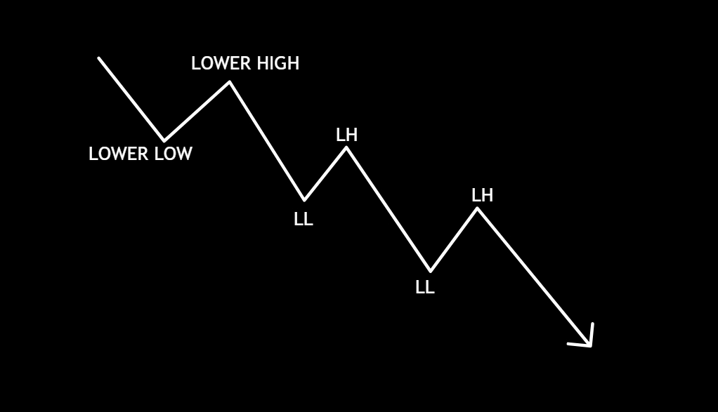
- A downtrend (bearish structure) shows a series of lower highs (LH) and lower lows (LL).
These sequences don’t just tell you what happened; in fact, they provide powerful clues about what’s likely to happen next. In short, structure is your map for identifying whether the bulls or bears are in control, or if the market is simply indecisive and moving sideways in a range.
Structure vs. Patterns: A Crucial Distinction
Before we go further, it’s vital to clear up a common point of confusion: Market Structure and Market Patterns are not the same thing.
- Structure is the big picture—the overall directional flow of the market (bullish, bearish, or ranging).
- Patterns (like flags, triangles, or wedges) are smaller formations that occur within that broader structure.
Think of it this way: structure is your roadmap, while patterns are the road signs along the way. Indeed, understanding this distinction is a key step that separates amateurs from professionals.
The Engine Room: How Supply and Demand Create Structure
So, where does this structure actually come from? Every swing high and swing low originates from one simple, powerful force: the tug-of-war between supply and demand.
When demand (buyers) outweighs supply (sellers), price rises aggressively. Conversely, when supply overwhelms demand, price drops. These battles manifest as candlesticks, and together they form the wave-like movements—the pushes and pullbacks—that build market structure.
Ultimately, behind every chart is a story of human psychology: impulse, greed, fear, and exhaustion. That’s why market structure trading is so potent—it reveals what the crowd is doing, often before the crowd even realizes it themselves.
The Three Faces of the Market: Identifying Structure Types
Now that we understand the forces that form structure, let’s explore its three primary types. Recognizing which phase the market is in provides critical context for your trades.
1. Trending Structure (The Money Maker)
This is when the market has a clear directional bias. Trends consist of two alternating phases:
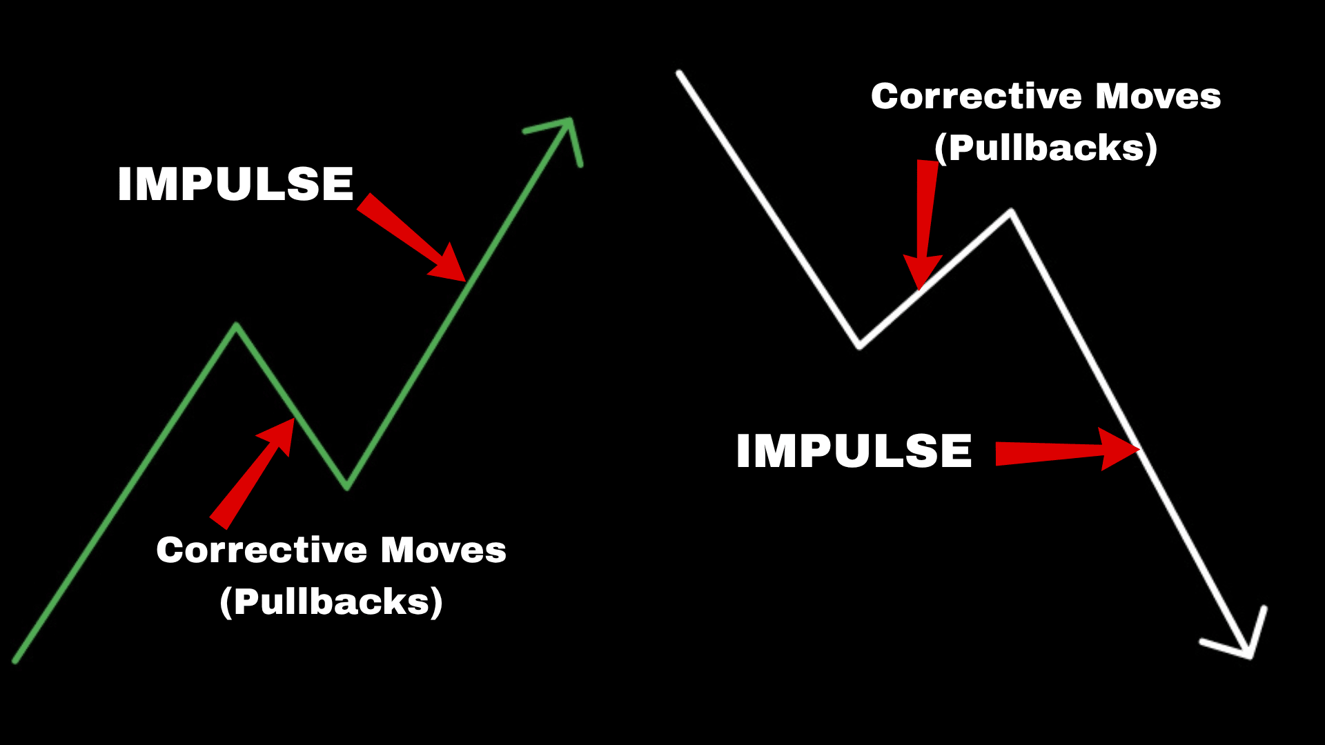
- Impulse Moves: These are the strong, fast moves in the direction of the trend. During these moves, the dominant side (buyers in an uptrend, sellers in a downtrend) is in full control.
- Corrective Moves (Pullbacks): These are the pauses or temporary pullbacks against the trend. Here, the market is taking a breath, shaking out weak hands, and allowing traders to reposition. A correction does not mean the trend is over; on the contrary, it’s a necessary part of its rhythm.
As a trader, your goal is to get in sync with this rhythm. Therefore, instead of chasing a fast impulse move, a more strategic approach is to wait for a correction into a key support or resistance level to find a lower-risk entry.
[Image: A clear chart showing a bullish uptrend with higher highs (HH) and higher lows (HL) labeled, with impulse and correction waves highlighted.]
Alt Text: A chart demonstrating bullish market structure trading with labeled impulse and correction waves.
2. Ranging Structure (The Waiting Game)
A ranging market occurs when price is trapped between a defined support and resistance level. In this scenario, neither buyers nor sellers can gain control, resulting in sideways price action. Ranges often form after a strong trend as the market “digests” the move.
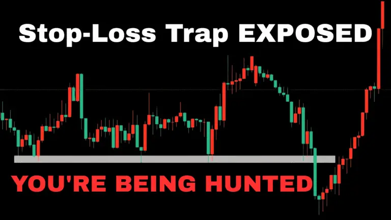
However, be cautious. Ranges are notorious for traps like false breakouts (fakeouts) and stop hunts. For this reason, patience is paramount here. The professional approach is to wait for a confirmed breakout—where price breaks a level, retests it, and then continues—before committing to a trade.
3. Transitional Structure (The Turning Point)
This is the most dynamic phase, where the market shifts from one state to another (e.g., from a trend to a range, or from a bullish trend to a bearish one). These transitions often form classic reversal patterns like Head and Shoulders, Double Tops, and Double Bottoms.
These aren’t just textbook drawings; instead, they represent the visual story of momentum fading and control shifting from one side to the other. If you can learn to spot these transitional phases early, you put yourself ahead of the crowd at the precise moment the risk-to-reward ratio flips in your favor.
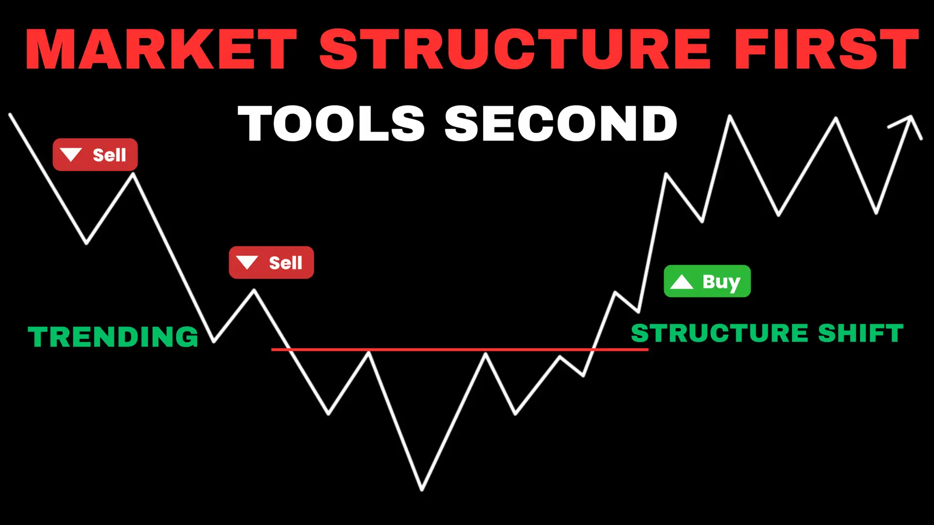
Getting Tactical: How to Spot a Market Structure Shift
So, how do you identify these turning points in real-time? There are two key concepts every structure trader must master:
- Break of Structure (BOS): This occurs when price breaks a previous swing point in the direction of the trend, confirming the trend is continuing. For instance, in an uptrend, breaking the previous high is a bullish BOS.
- Change of Character (CHoCH): This is our first major clue that a reversal might be underway. It happens when price breaks the most recent structural low in an uptrend, or the most recent structural high in a downtrend. Essentially, it shows the market is acting differently and the opposing side is gaining strength.
Consequently, reading BOS and CHoCH in real-time allows you to stop being surprised by the market and start anticipating its next move.
The Pro-Level Secret: Mastering Multiple Timeframe Analysis
Here’s a concept that truly separates successful traders from the rest: understanding that structure is fractal. In other words, a clear uptrend on the daily chart contains smaller trends, ranges, and pullbacks on the 1-hour or 5-minute charts.
If you aren’t aligning your analysis across timeframes, you’re setting yourself up to get caught on the wrong side of a much bigger move. For example, buying based on a bullish 5-minute structure might be a trap if the 4-hour chart is in a clear, dominant downtrend.
Here’s a simple, top-down approach:
- Higher Timeframes (Daily, 4H): Use these to identify the dominant market structure. This tells the main story.
- Lower Timeframes (15M, 5M): Then, use these to find entry triggers, like a CHoCH or a retest of a key level, that align with the higher-timeframe story.
Trading with this structural alignment gives your trades context and dramatically increases your probability of success.
Tools of the Trade: Using Indicators to Confirm Structure
Now, let’s talk about indicators. From my professional standpoint, indicators should never be the primary reason for a trade. They are tools for confirmation, not prediction. When your read of the market structure aligns with what an indicator is telling you, your confidence in a setup grows.
Trending Markets: Moving Averages
In a clear trend, Moving Averages (like the 9/20 EMA for day trading or the 50/200 SMA for swing trading) act as dynamic zones of support or resistance. For instance, when price pulls back to a relevant moving average during a trend, it can offer a high-probability entry zone.
For Ranging Markets: Oscillators like RSI
But what about when the market isn’t trending? For a sideways, ranging market, oscillators like the Relative Strength Index (RSI) are invaluable. They measure momentum and help identify “overbought” and “oversold” conditions. When price hits the top of a range and RSI is overbought, it adds weight to a potential reversal down. Likewise, the opposite is true at the bottom of the range.
The Volume Profile Advantage & Market Structure Trading
Finally, let’s discuss a tool I find indispensable: the Volume Profile. Unlike other indicators, it shows you where traders conducted the most business.
- In ranges, it highlights high-volume nodes that act like price magnets.
- In trends, it reveals low-volume gaps where price can move quickly and high-volume areas from past battles that will likely act as future support or resistance.
I always recommend using a Fixed Range Volume Profile on a specific structural leg to see where the volume is within that move.
I have a full video on how to use Volume Profile effectively—I highly recommend checking it out to master this powerful tool.
Conclusion: Trading with Purpose and Intent
At its core, all price movement comes from the simple push and pull of supply and demand. Market structure trading provides the framework to read that battle on the chart. Moreover, it allows us to see who’s in control, anticipate shifts in momentum, and plan our trades with purpose.
By combining this foundational understanding with a multi-timeframe perspective and the right confirmation tools, you’re no longer just reacting to price—you’re reading it with intent. Master this, and every chart you look at will start to make a whole lot more sense.